Your Ecommerce landing page is the single most powerful place on your web store.
This is the place where buying decisions are made. It’s where your visitors become your customers. The shopping cart may be where they fill in their details, and your SEO and inbound content might land them on your site in the first place, but this is where the choice is made, and everything on the product page should be geared towards inspiring that choice and closing that sale.
To create a landing page that converts, you must adhere to some basic principles of web design. The entire page should push the visitor to purchase, from what they feel when the page opens, to where their eye is drawn and how they experience your brand through the UX.
But don’t worry, we have some guidelines that will make it all much easier for you!
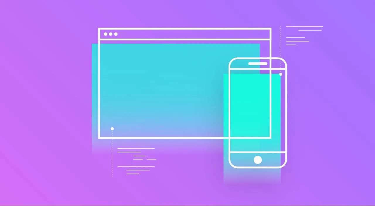
How to create Ecommerce Landing Pages that Convert

A Clear Page Heading
Start at the beginning. That is your Headline. If you are selling pink, sequined ladies dance shoes, make sure that the very first thing your customer reads is the heading “Pink, Sequined Ladies Dance Shoes”. Not only will they know they have come to the right product page, but Google will also know what the page is about.
A catchy headline should grab the visitors attention. Depending on the tone of your brand, you may want to use with very direct language, or add a little bit of personality. Just remember that your product page is there to sell.
Make sure your headline is:
- Clear
- Searchable
- Powerful
- Emotionally Evocative (if possible)
- Makes use of “now” words which create a sense of urgency “Get your Pink, Sequined Ladies Dance Shoes While stocks last!”
This headline Tells the reader what to do (purchase), What they are buying (pink sequined ladies dances shoes) and when to do it (while stocks last). It also clearly tells Google what the page is about.
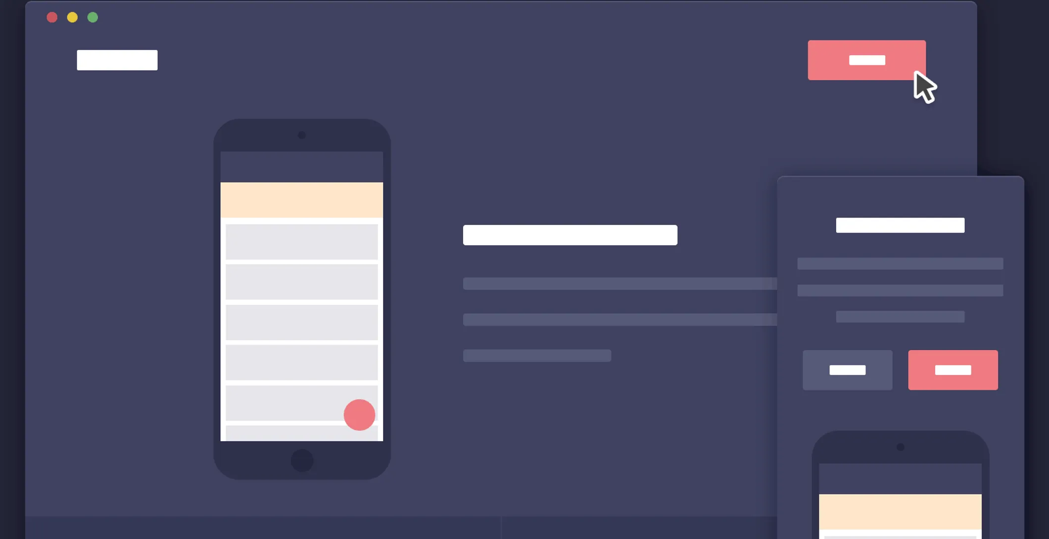
Page Layout
The layout of your page refers to where the visitor sees different things on the page. Make sure that you leave plenty of white space around your text, your product image and your Call to action (CTA).
Too much clutter on your purchase page will distract visitors from the main goal of the page: selling a product.
Even if you choose a single color background, make sure that there is enough space between things.
Have you ever landed on a page that was too full of images, text and pop-ups? It’s not pleasant. It tends to make you want to close the page as quickly as possible. It also feels a little like spam – which means that your potential customers might get spooked and leave.
The Perfect Product Page Layout should be:
- Clean and simple
- Copy should be easy to read in a clean, clear typeface
- Use clear sub-headings and bullets to break copy up into readable “snackable” bits of information.
- Keep paragraphs few, short and to the point.
- Insert a “Read More” or sub-menu for additional product information, to prevent over-whelming your customer.
- Make sure you use the same typeface and design guidelines in your Email and your Landing pages. This helps the customer to feel like they have stayed in the same safe space from when they clicked through to you.
Use Visual Hierarchy to Improve Conversions
This is means you lead the visitor to purchase through step by step elements in your page design. It’s the path their eye follows when they land on the page, and the reason why most pages are set up with the image on the top Left, Name above and Copy to the Right.

Things to keep in mind with Visual Hierarchy
- Keep copy short and succinct
- Use Bullets
- Place your Headline in a prominent position
- Give prime space to your images
- Watch the spacing and placement of CTAs and other on page elements
If you are not certain, go and take a look at some the successful online stores and see if you can spot the similarities in their design.
Call to Action (“Add to Cart” Button)
Make sure your CTA is clear and easy to understand. You want to make the purchasing journey as easy as possible for your customer. They shouldn’t ever have to wonder how to buy the product on the page.

Make sure that your CTA is:
- Clearly Visible
- Above the Fold
- Uses clear, language
- Includes an action word
- Use white space around the CTA
- Use contrasting colours to make it stand out
- Use word like “my” instead of “your”
- Create a sense of urgency – use words like “now”
Product Landing Page Images
Only the very best images of your products will do. We recently published an article on how to take your own product photos {insert link to relevant article} which can give you some pointers if your budget is forcing you to take your own photos.
Your images are truly what sell your product. They have to attractive enough to make someone want to buy what they see. They need to be clear and bright and evocative.

They also need to tell your customer what they need to know about the product.
Landing Page Photos should be
- Clear, with each product individually photographed with lots of white space around it
- Large enough to show off product details like tassels or bows
- High quality – don’t ever use grainy photos
- Include a zoom in feature. Things like a stitching detail can be what makes the sale
- You should have multiple angles of the same product. Let people see how it looks from all sides.
- Include something to scale size if product size is a common confusion point
- Include an image of the product in use if you can
- Lighting needs to be consistent
- Padding around the image should be at least 30 pixels
Let your Landing Page create Trust
Especially if your brand or store is not well established yet. You need to show people that they can trust your product and your service. A fantastic way to do this is to display any awards, positive customer reviews and product recommendations you have received.
Awards can be displayed in the top left corner of the page, all others can go below the fold. Create a sub-heading that says something like “Here’s what our customer’s think of us” or “customer reviews”.

Then post quotes, reviews and relevant accolades and certificates for your product or service under this headline.
On Page Reviews should be:
- Positive
- Short and to the point
- They should be used in their original, natural language
- You should source your reviews to who said them, even if you only say “Jo, from Pretoria”
- Make sure that they never link away from the product page. You want to keep the visitor here.
- Offer the visitor a chance to leave their review (just make sure you have it set up so that it will not be published before you review it). This lets them know your reviews are real, and that you value their opinion of you.
Include a Wish List
Not everyone on your site is going to want to purchase the very first time they visit. A Wish List can be a very valuable tool for you as an Ecommerce store. Make sure you optimize on it.
Place the “Add to Wish List” Button below or next to the “Add to Cart” button.
Why Wish Lists are important on your Product Landing Page
- They allow you to capture your visitors Email as you can only use the Wish List if you log in or register
- Once you have the Email address of your visitor you can remarket the wish list items to your customer when they are on promotion
- It allows you to know what items you should place on promotion
- It allows them to come back later and easily find what they want
- Make wish lists shareable – your visitor is now marketing for you, and telling their peers that `you have their trust
Product Landing Pages that Sell
To sum up, the most important thing to remember is to keep your pages consistent. You can’t use different fonts and design templates on different parts of your Ecommerce site.

Visitors need to feel like they are in a unified digital space or they will see you as a fraud.
Test your Landing Pages. A/B testing is essential to the Ecommerce game. Run some tests and see what works best for your business.
Keep Images beautiful. They sell more than any other element on the page.
Keep copy short but effective. Well written copy has the power to convert visitors into customers through emotion, action, and clarity.
Use plenty of action language! Make purchasing as easy as possible.
Don’t forget to brag. Highlight what makes your product great. Tell the visitor how it will improve their life. Use bullet points for your key features!
Last of all, do your homework. It’s important to take the time to see what your peers and your competitors are doing. You may save valuable time and resources by learning from their successes and failures.