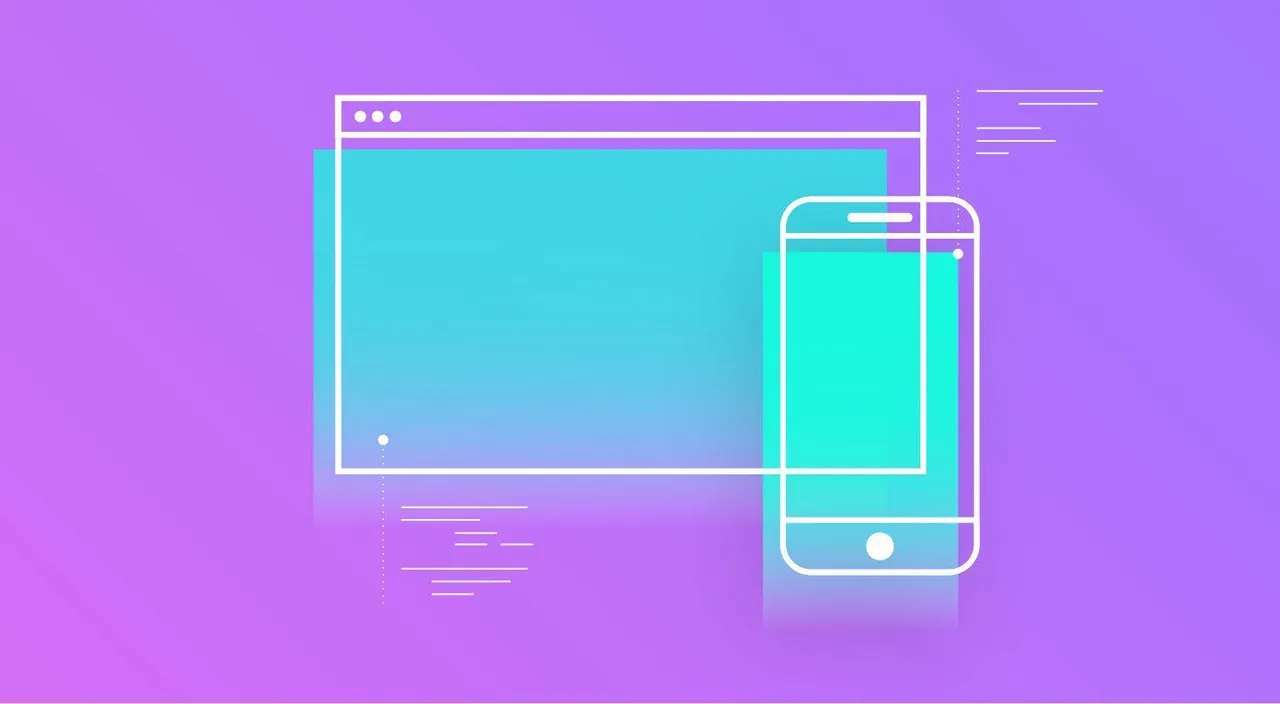
Optimised webshop navigation is key to increase conversations and lower the number 0f users who leave your webshop all too soon. User-friendly navigation is one of the most important components to take into consideration when looking to improve the shopping experience and make all things run smoothly for customers who land on your website.
Customers need to be able to find products quickly and to do that, your navigation needs to be intuitive. Also, navigation should be designed in such a way to reduce the number of clicks a customer needs to make to find the information he/she is looking for. Finally, navigation needs to be easy and lead customers from product searches to check outs in a very straight-forward way.
We rounded up 5 of the most useful suggestions for you to improve your eCommerce webshop navigation right now!
Webshop navigation labels: one-word category labels
The top-level navigation on your eCommerce website should instantly point towards the categories of products or services you offer.
The navigation labels should be clear: one-worded and descriptive of the general category of a set of services or products you sell.
When a user lands on your homepage, the first thing he/she needs to see is all the type of products or services you offer. The navigation bar should stick out among all other homepage items as you want your customers to shop rather than to browse through any secondary information you may feature on your website!

Product subcategories
The navigation bar should be organised in such a way to arrange the products in a hierarchy from general to more specific.
However, in cases when there is a specific subcategory that you know is popular with your customers, you may want to include it in the top level navigation bar. Also, some products may be listed in more than one category or some subcategories may be featured on more levels.
The way you organise and display your subcategories should follow 2 criteria:
- the easiest way for a customer to find a specific product by following an intuitive category hierarchy
- the most popular categories (the ones that feature the most searched products) may be included in the top navigation bar

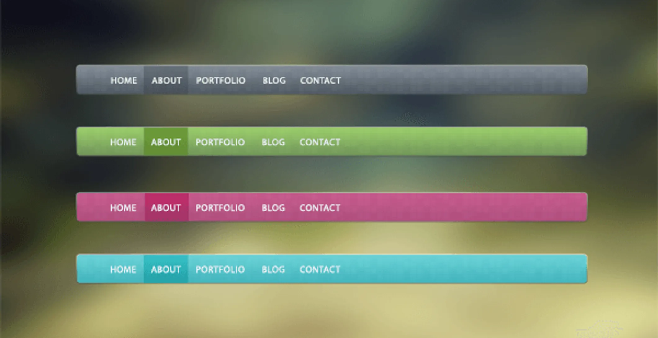
Place navigation where the customer expect to find it
Being able to decide and play with your website design can be quite a bit of fun. Often people get carried away in finding original ways to display different website elements in an attempt to make the website stick out among similar ones.
However, always bear in mind that there is a reason why most website display some elements (such as the navigation bar) in a very conventional way - because users are expecting to find it displayed there.
When you browse webshops, where do you look first in order to find a particular category or product? Either top of the page - centered or left of the page - downwards, right?
Displaying the navigation bar and labels where customers can’t see it right away is simply not a good idea unless you have built your brand’s popularity upon a particular website design.

Search bar: yes or no?
Absolutely yes!
There are 2 types of customers: those who know exactly what they are searching for and those who want to see what you have to offer.
The navigation bar and labels target the second category of customers. However, for customers who want to find a specific article, the search bar is a great plus to have.
Remember that if a customers can’t find what they're looking for in a reasonable amount of time, they may look for it on another site. This is why you need to organise your website to make things as easy as possible for the customer - first and foremost when he or she is looking for a product.

Sales and offers are a top level navigation label
Shopper usually do respond to offers, discounts and sales. If they landed on your website just to check out your products and they see there is a sale going on, they may become customer rather than just visitors.
If you do have regular sales and offer discounts for particular products, it’s worth putting a sale/offers label in your top level navigation bar.
Also, this is a great way to push potential customers to purchase more than just the product they were looking for initially as a product on discount will probably end up as a secondary product to be added in a shopping cart.

In doubt, there is always one very effective way to make sure you’re getting things right. Ask yourself what kind of navigation bar and labels make your shopping experience really good when you hunt for products.
Putting yourself in your customers’ shoes is key to improving your website in terms of user-friendliness and usability!